Using Microsoft's Power BI Analytics Tool for Water Advocacy
I put Power BI's business analytics capabilities to the test investigating water quality issues in Southwest Florida.

I live in Fort Myers in Southwest Florida. Our area has been experiencing a worsening water quality situation that has recently resulted in what is widely termed an “ecological disaster.” Large outbreaks of harmful algal blooms in both freshwater and saltwater ecosystems have led to devastating marine life die-offs and negative effects on human health and the local economy.
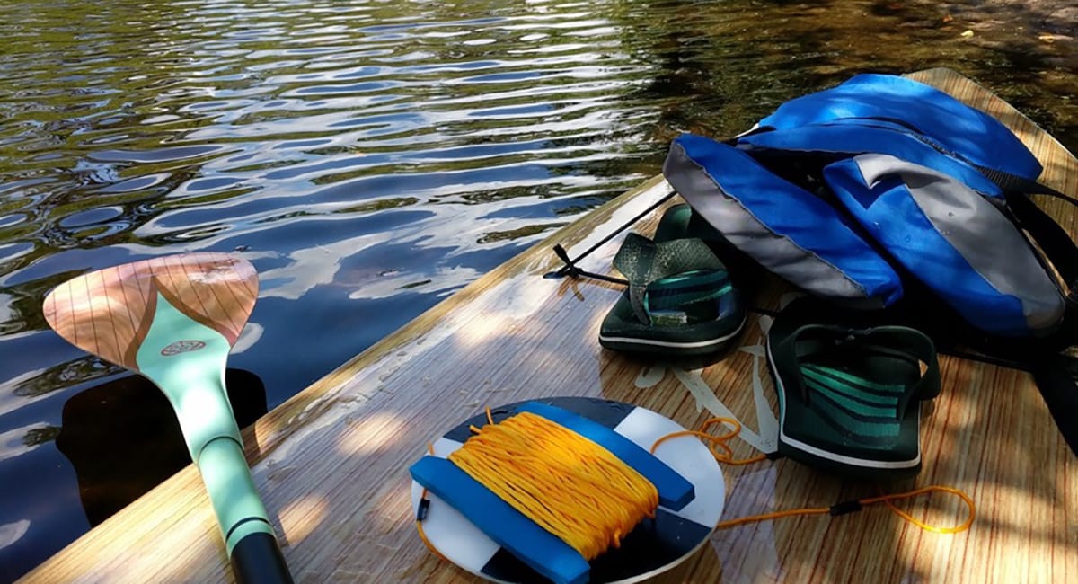
Calusa Waterkeeper is our local chapter of the global nonprofit organization Waterkeeper Alliance. I began working with Calusa Waterkeeper in early summer 2018 by becoming a volunteer ranger. The role of Calusa Waterkeeper is to advocate for fishable, swimmable and drinkable water. This advocacy is accomplished by patrolling and testing water within a jurisdiction that includes Lake Okeechobee, the Caloosahatchee River, and the Estero Bay and Pine Island Sound coastal areas.
Data for Advocacy
What attracted me to Calusa Waterkeeper is their focus on data collection as a means toward advocacy. Data collection and investigation in marine environments feeds right into my interests in biology and analytics. During times of crisis, many clean-water advocates make signs and stand on bridges, I opted to make a Power BI dashboard.
With Power BI Pro, I knew I would have access to the tools I needed to create a data set for my dashboard. Data prep is a critical step in any analysis and with Power BI Pro, it’s a breeze. Additionally, the visualization features in Power BI Pro gave me everything I needed to produce my dashboard in just a few clicks and drag-and-drops. The best part is that all of this functionality is served up in the familiar and intuitive Microsoft interface.
Regardless of your level of experience with data analytics, Power BI meets you where you are. For this reason, I commonly recommend Power BI as both a starting point and a catalyst for advancement for my customers on their analytics journey.
Collecting the Data
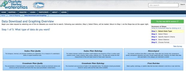
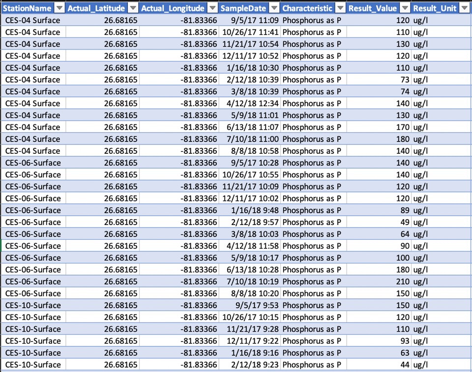
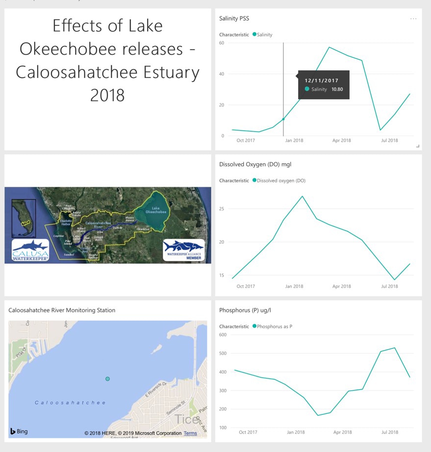
To truly understand what was happening to our local watershed, I needed data and context. For data, I turned to Charlotte Harbor Wateratlas, which maintains a wealth of water-related data. I was able to download data collected from a sensor located in the Caloosahatchee River with information on salinity, dissolved oxygen and phosphorus levels.
The river carries fresh water to the Gulf of Mexico, which means that there is a gradient of salinity that goes from high to low as you move inland. This gradient is important for marine life that are sensitive to different levels of salinity. Dissolved oxygen is an indicator of how much oxygen is available to or being produced by aquatic life. Phosphorus is an indicator of eutrophication, which can lead to harmful algal blooms. A combination of these factors would produce context around what was happening in the water.
After narrowing down the exact data I needed: station name, actual latitude, actual longitude, sample date, characteristic, result value and result unit, I created tables in Excel and loaded them into Power BI.
With my data in Power BI, I was able to quickly build line charts to visualize the changes in salinity, dissolved oxygen and phosphorus levels over time. I was also, with a little help from Google and YouTube, able to create a visual of where the monitoring station is located.
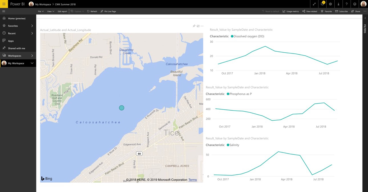
With my report created, I was able to pin my tiles to a dashboard, add some additional content for color and I now had a visual representation of what occurred during the early summer months.
Data-Driven Insights
Large freshwater releases from Lake Okeechobee pushed fresh, nutrient-laden, murky water down the Caloosahatchee River, as evidenced by the drop in salinity, increase in phosphorus and decrease in dissolved oxygen. The dramatic change in these three characteristics is just one piece of the puzzle in understanding the effects of these freshwater releases; however, seeing them next to each other provided clarity around the coincidental timing of the lake releases.
The renowned professor Ian Lowe was quoted as saying, “Data isn’t information; information isn’t knowledge; knowledge isn’t wisdom.” Any journey into analysis holds true to that statement.
In my example, I had data, but I had to find the specific information I needed. Once I had the information, I could analyze it to build some knowledge. With that knowledge I could add to the larger narrative with an attempt at wisdom, wisdom that can hopefully help advocate for better water policies in Florida.
When working with customers on their data analytics projects, I help them identify their own means of transforming data into information, into knowledge, into wisdom. No matter the use case or the desired outcome, starting with data is key. However, the process of extracting wisdom from that data is where your time is best spent. Your story, told in dashboard form, is only as good as the wisdom it disseminates. A dashboard without wisdom powering it may as well be full of pretty pictures of question marks.